
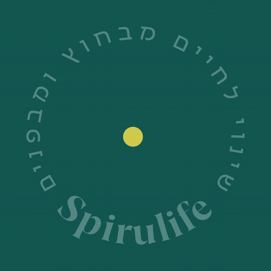
Spirulife
Team Hybrid Partners, TLV Project Year 2022-2024
BRAND IDENTITY DESIGN / PACKAGING / COMMUNICATION STRATEGY
Spirulife is a beauty brand that prides its self on providing organic and natural products. Its philosophy of positive change places emphasizes on both an inward & outward approach. This dual approach aligns seamlessly with their primary product categories: cosmetics and superfoods. The symbol of a spiral visually communicates this philosophy and the word resembles the original name retaining brand recognition.
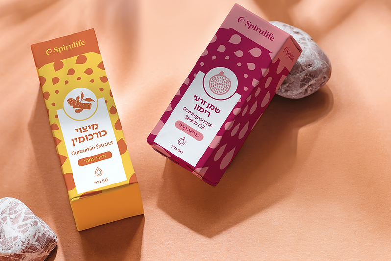
The brand language is colorful, vibrant and fresh. It evokes a sense of positive change and incorporates a diverse range of raw ingredients within its language. The brand language is composed of a diverse array of illustrations and colors. We used geometric grids to frame these graphic elements into structured designs.
We created a visual design system that enables flexibility to include vast & diverse categories of products. The packaging language needed to expand extensively in order to look unique while still being cohesive. The challenge here was to craft a design system that unifies all designs and enables the continuous creation of fresh and distinctive packaging.
The end result is a colorful and energetic brand that effectively communicates its positive impact through its language while being aesthetically pleasing.


Describe your image

Describe your image

Describe your image
Describe your image


